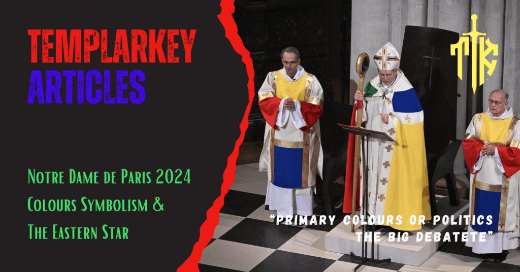
Notre Dame de Paris 2024 Colours Symbolism: Primary Colours or Politics The Big Debate
The Conspiracy Theorist Option
We start this article with a lens often reserved for the curious and the sceptical: the conspiracy theorist’s perspective. As Notre Dame de Paris reopens its doors, adorned with carefully chosen colours and symbolic design, whispers emerge about deeper, hidden meanings. Could the palette and imagery nod to ancient orders, such as the Eastern Star, or hint at a narrative deliberately woven into the cathedral’s rebirth? In this section, we dive into the theories, exploring whether this restoration is simply a homage to history or a cryptic message waiting to be uncovered.
The Secret Symbolism Behind Notre Dame’s Reopening: Are Jean-Charles de Castelbajac’s Liturgical Vestments Linked to Occult Orders?
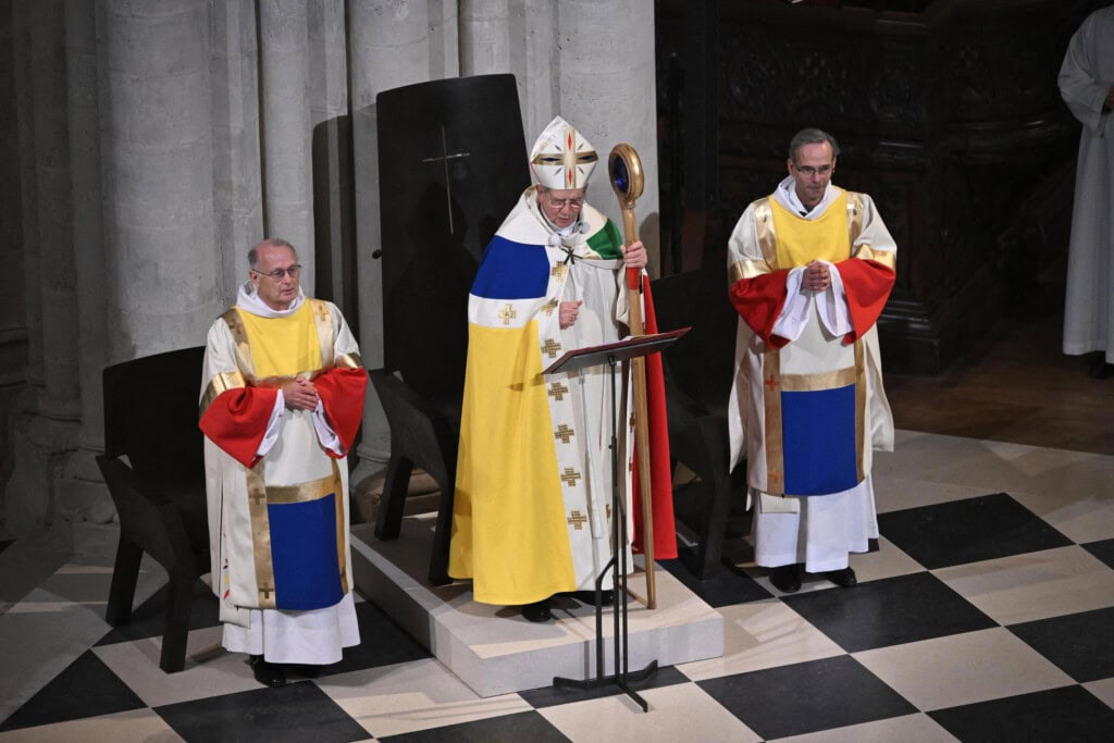
The December reopening of the iconic Notre Dame Cathedral in Paris came with great fanfare and awe-inspiring visuals. However, a curious design choice has sent ripples through those attuned to the symbols of power and control. French fashion icon Jean-Charles de Castelbajac, renowned for his bold artistic vision, designed the liturgical vestments for the priests officiating at the event. While ostensibly celebrating spirituality and renewal, these garments showcase a striking—and highly deliberate—colour scheme that mirrors that of The Order of the Eastern Star, a Masonic offshoot organisation.
The Curious Colors
Castelbajac’s vestments prominently feature the five symbolic colours:
- Red: associated with fire and martyrdom.
- Blue: linked to water, spirituality, and truth.
- White: a dual representation of purity and illumination.
- Yellow (Gold): symbolises enlightenment or higher power.
- Green: representing earthly growth and renewal.
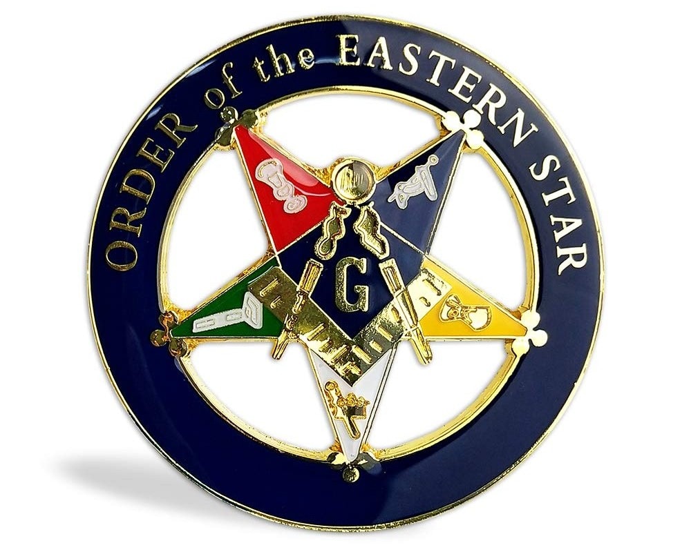
It doesn’t take a keen observer to notice that these exact hues align with the Eastern Star emblem, a group often tied to esoteric Freemasonry practices. Though ostensibly a “female-focused organisation,” Eastern Star draws deep connections to arcane knowledge, star symbolism (Venus and the Pentagram), and secret spiritual enlightenment.
Why would Jean-Charles de Castelbajac, a designer known for his use of bold iconography and Christian references, choose such a provocative palette?
Could it be a mere coincidence, or does the reopening of Notre Dame serve as a symbolic statement about power and secrecy?
After all, Notre Dame’s original construction is riddled with Gothic enigmas and coded messages from centuries past—clues left by stonemasons and builders tied to esoteric traditions.
Castelbajac’s Connections
We must remember that Jean-Charles de Castelbajac has always embraced the fusion of religion and pop symbolism, often flirting with irony. His past works include rainbow-coloured cassocks and “pop art” crosses that blur the lines between reverence and irreverence.
Could this choice, then, be an effort to subtly nod toward a continuation of secret traditions hidden behind the veneer of Christian renewal?
The reopening of Notre Dame is undoubtedly historic, but Castelbajac’s colour scheme feels less like innocent artistic whimsy and more like an intentional signal to those “in the know” and a whisper that ancient orders still hold sway, even over the sacred. Are we witnessing a subtle infiltration of esoteric influences into the heart of French Catholicism, hidden in plain sight? The symbols are there for those who choose to see.
The Big Debate: Critical Thinking Response
Jean-Charles de Castelbajac’s Liturgical Vestments: Art, Renewal, and a Celebration of Christian Hope
Conspiracy theories thrive on coincidence masquerading as connection. Let’s set aside speculative sensationalism and examine the facts behind the liturgical vestments designed by Jean-Charles de Castelbajac for the reopening of Notre Dame Cathedral.
The Grand Reopening of Notre-Dame
On December 7 and 8, Paris celebrated the long-awaited reopening of the 800-year-old Notre-Dame Cathedral, now restored to its former glory after the devastating 2019 fire. A team of talented artisans has meticulously revived this iconic symbol of faith and French heritage. One of the highlights was undoubtedly the new liturgical vestments worn during the reopening mass, designed by none other than Jean-Charles de Castelbajac.
A Legacy of Color and Creativity
Jean-Charles de Castelbajac (or JC/DC as he is also known) has been a unique presence on the international fashion scene since the 1970s. Known for dressing pop culture icons like Madonna and Lady Gaga, his imaginative and colourful creations range from streetwear to avant-garde artistry. Yet his work for the Catholic Church is equally significant. In 1997, Castelbajac famously designed the rainbow-hued robes worn by Pope John Paul II and thousands of priests for World Youth Day in Paris.
The Pope himself praised him, saying, “You have used colour as the cement of faith.”
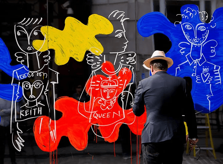
This spiritual connection runs deep. Castelbajac often blends faith and art, whether learning about street art across Paris (angelic graffiti by his friend Keith Haring) or his cousin Claire de Castelbajac, who is a candidate for sainthood.
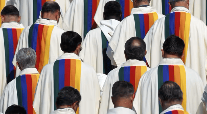
The Notre Dame Vestments: A “Creative Dialogue”
The commission to design the vestments for Notre Dame came directly from church leaders, led by Mgr. Olivier Ribadeau-Dumas, the cathedral’s rector. Castelbajac was given complete creative freedom under one guiding principle: to embody “noble simplicity.”
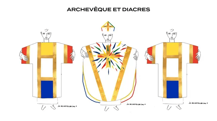
Drawing inspiration from the massive golden cross in Notre Dame’s choir—a symbol of resilience that survived the fire—Castelbajac created off-white vestments to match the cathedral’s stone interior. The carefully chosen bursts of colour evoke the cathedral’s stunning stained glass, representing a rebirth of light and hope. Unlike traditional embroidery, the colourful patches are flocked, a subtle nod to modernity and accessibility, as seen in streetwear design.

Jean-Charles de Castelbajac’s designs for the Notre Dame reopening vestments also pay subtle homage to the spirit of Danilo Donati, the legendary Italian costume designer. Donati, best known for his collaborations with directors like Federico Fellini and Pier Paolo Pasolini, was celebrated for his ability to blend medieval aesthetics with futuristic visions in film. His work, seen in iconic productions such as The Canterbury Tales (1972) and Fellini Satyricon (1969), showcased elaborate costumes that combined historical references with an imaginative, almost otherworldly quality. Donati was a master of visual storytelling, using costumes to create a bridge between eras and evoke timeless yet contemporary beauty.
Similarly, Castelbajac incorporates Donati’s stylistic ethos by merging medieval and religious symbols with modern design techniques. By introducing elements inspired by streetwear, such as flocked patches reminiscent of sweatshirt textures, Castelbajac infuses his liturgical vestments with a contemporary sensibility that resonates with younger generations. This balance of reverence for tradition and bold modernity creates spiritually meaningful and artistically innovative garments, much like Donati’s groundbreaking costumes.
The vestments, crafted by the renowned 19M association (owned by Channel) of haute couture artisans, are not just for show. They represent a lasting contribution to Notre Dame’s ongoing liturgical life, a blend of history, spirituality, and contemporary artistry. The creation of the vestments was a collaborative effort by some of France’s most esteemed artisans: embroiderers Lesage and Montex, goldsmith Goossens, milliner Maison Michel, and the Paloma atelier, renowned for working with delicate fabrics. Together, they produced over 2,000 chasubles, dalmatics, and stoles worn by the clergy during the reopening ceremonies and will continue to serve in future significant celebrations at the cathedral.
A Celebration of Renewal, Not Esotericism
Conspiracy-driven claims linking these vestments to occult organisations miss the point entirely. Castelbajac’s work reflects his deep respect for the Catholic tradition and his lifelong commitment to merging art with faith. The colour scheme—red, blue, white, gold, and green—is rooted in liturgical symbolism and Notre Dame’s heritage, not the arcane workings of fringe groups.
At its core, the reopening of Notre Dame—and Castelbajac’s luminous designs—celebrates the triumph of art, faith, and humanity over tragedy. Far from hidden meanings, the vestments stand as a visible sign of hope, unity, and renewal for Paris, the Church, and the world.
For those willing to look beyond baseless speculation, Castelbajac’s creations offer a powerful reminder: beauty and meaning are sometimes exactly what they appear to be.
Conspiracy theories thrive on coincidence masquerading as connection. Let’s set aside speculative sensationalism and examine the facts behind the liturgical vestments designed by Jean-Charles de Castelbajac for the reopening of Notre Dame Cathedral.
A Reverence for History and Faith
Jean-Charles de Castelbajac is not a stranger to ecclesiastical design; he is a designer deeply respectful of Christian symbolism, liturgical tradition, and the weight of visual language. His work for the reopening of Notre Dame reflects an artist’s attempt to merge modernity with sacred history, reintroducing colour and life to a space tragically marred by fire.
The colour palette—red, blue, white, gold, and green—has roots deeply entrenched in Catholic iconography and liturgy:
- Red symbolises the Holy Spirit, the blood of martyrs, and divine love.
- Blue, often associated with the Virgin Mary, represents heaven, purity, and grace.
- White signifies light, resurrection, and the divine.
- Gold reflects Christ’s kingship and eternal glory.
- Green symbolises the liturgical “Ordinary Time,” growth, and renewal in the Christian calendar.
Far from a shadowy nod to “The Order of the Eastern Star,” Castelbajac’s choice is profoundly liturgical and scripturally sound. These colours appear in everything from medieval stained glass to traditional vestments throughout the Catholic Church. They reflect continuity, not conspiracy.
Castelbajac’s Vision
Castelbajac himself has repeatedly expressed that he seeks to “reignite Christian joy through colour.” In interviews, he describes how the devastation of Notre Dame became a personal calling — to create vestments that “embody light, life, and transcendence” after a period of darkness.
Furthermore, Castelbajac’s broader career has consistently explored the interplay of art, faith, and humanity. His signature use of bold primary colours shows the simplicity of spiritual innocence, much like Giotto’s frescoes or Chagall’s stained-glass windows. To reduce his work to conspiratorial machinations undermines the sincerity of his artistic mission.
A Cultural Celebration, Not Esotericism
The reopening of Notre Dame marks a cultural and spiritual moment for France—a testament to human resilience, art, and faith. Castelbajac’s vestments honour the Church while injecting contemporary vitality into its sacred symbols.
Rather than searching for occult connections in the paintbox, we might better appreciate Castelbajac’s work as an invitation to embrace hope, colour, and a renewed spiritual awakening in a world too often clouded by darkness.
If the colours are symbolic, let us remember they symbolise Christian renewal—not shadows of secret orders, but the light of a cathedral restored to its full splendour.
The Power of Primary Colours
Jean-Charles de Castelbajac’s designs often centre on the use of primary colours—red, blue, and yellow—alongside white and green. Primary colours hold a unique significance in both art and symbolism: they are the foundational hues from which all other colours are created. Their simplicity, clarity, and universal appeal make them powerful tools for visual communication, evoking a sense of purity and essential truth in design. For Castelbajac, these colours embody the core principles of his work—boldness, joy, and accessibility—while simultaneously paying homage to the timeless beauty found in religious art, stained glass, and medieval iconography.
Why Primary Colours Are Chosen
Beyond their artistic utility, primary colours carry deep emotional and symbolic weight:
- Red symbolises passion, sacrifice, and divine love.
- Blue evokes spirituality, peace, and heavenly grace.
- Yellow (Gold) represents light, glory, and eternal life.
These associations are deeply rooted in Christian tradition, where such colours appear prominently in religious art, vestments, and liturgical symbols to convey sacred truths. Castelbajac’s decision to incorporate these hues into the vestments aligns with his broader vision: to reignite faith and hope through the language of colour, bridging the past with the present.
The Eastern Star and Primary Colours
The Order of the Eastern Star, a Masonic-affiliated organisation, also uses primary colours in its emblem, but their meanings diverge slightly. Each point of the Eastern Star represents a virtue, symbolised by a specific colour:
- Red for courage and devotion (Adah).
- Blue for fidelity and faith (Ruth).
- Yellow for light and constancy (Martha).
- White for purity (Electa).
- Green for earthly renewal and growth (Esther).
These primary and secondary colours were chosen not for artistic purposes but to represent moral virtues tied to biblical figures and their stories. While some see parallels between the colour schemes in Castelbajac’s work and the Eastern Star, the shared hues are far more likely a result of universal symbolism, deeply embedded across faith traditions, rather than intentional reference.
By using primary colours, Jean-Charles de Castelbajac taps into a universal visual language that is both timeless and accessible. His designs for Notre Dame’s reopening vestments celebrate renewal, faith, and unity, transforming foundational colours into symbols of spiritual rebirth and artistic continuity.
Notre Dame de Paris 2024 Colours Symbolism Conclusions and questions
Colours in Art and Physics: A Dual Foundation
In the realm of painting and pigment, the primary colours are red, yellow, and blue. These hues are the foundation of the colour wheel, as they cannot be created by mixing other colours. By combining them in various proportions, all other visible colours can be formed, making them the building blocks of artistic expression.
In the context of physics and light, however, the primary colours shift to red, green, and blue (RGB). These are the additive primary colours of light, corresponding to the way the human eye perceives colour through the interaction of different wavelengths. When red, green, and blue light combine in equal measure, they produce white light, symbolising unity, purity, and the divine essence.
Isaac Newton
At the age of 23, Isaac Newton made a revolutionary discovery that forever changed humanity’s understanding of light and colour. Through a series of experiments using prisms and mirrors, Newton demonstrated that white light—once thought to be pure and indivisible—could be broken into its constituent colours, creating a spectrum like a reflected rainbow. By skillfully combining the red, green, and blue (RGB) regions of the spectrum, he proved that these three colours could be reunited to produce clear, unified white light. Newton called red, green, and blue the “primary colours” of light because they are the essential components required to restore light to its original clarity.
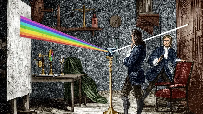
In religious and philosophical terms, this discovery holds profound symbolism. The clear white light that emerges from the union of the three primary colours becomes a powerful representation of God—the source of all creation, unity, and divine perfection. Just as God is the pure, indivisible essence from which all things flow, white light is the unifying force that contains the fullness of the spectrum. Newton’s work can be seen as a scientific echo of theological truths, where the divine (white light) exists as both a singular essence and the origin of all diversity (the colours of creation).
Jean-Charles de Castelbajac’s use of primary colours, as we can see in his Street Ware, draws on this rich symbolism. By reflecting the unity and purity of God through red, green, and blue, Castelbajac’s designs become a theological statement, echoing the revelation of God as light itself—a light that gives life, hope, and clarity to the world. In the context of the Notre Dame reopening, these colours invite us to contemplate the divine unity that emerges even after darkness and destruction, a symbol of spiritual rebirth and eternal light.
Religious and Philosophical Symbolism of Colour
Furthermore, in religious theology and philosophical thought, the symbolism of colour draws from both natural phenomena and spiritual metaphors. Red, yellow, and blue—rooted in artistic traditions—are often seen as reflective of divine attributes:
- Red: Symbolises divine love, sacrifice, and the blood of martyrs. It represents Christ’s Passion and the intensity of God’s love for humanity.
- Yellow (Gold): Represents light, glory, and eternal wisdom. It symbolises the radiance of God and Christ’s kingship over the heavens and earth.
- Blue: Evokes heavenly grace, peace, and the eternal realm. It is often associated with the Virgin Mary as a symbol of divine protection and intercession.
Together, these colours represent not just the divine attributes individually but also reflect the unity of the Holy Trinity:
- Red for the Son (Christ’s sacrifice).
- Yellow for the Father (eternal glory and wisdom).
- Blue for the Holy Spirit (grace and peace).
Philosophically, these colours form a triadic harmony—a foundational principle of balance, creation, and completeness. The interplay of the three mirrors the Trinity’s inseparability and mutual relationship.
The Rainbow: A Symbol of Unity and Totality
When these primary colours interact, either in pigments or in light, they produce a rainbow—a full spectrum of visible colour. The rainbow holds profound religious and philosophical significance:
- Theological Symbol: In the Old Testament, the rainbow represents God’s covenant with Noah after the flood (Genesis 9:13–16), a promise of mercy, renewal, and divine grace. It signifies harmony between heaven and earth, uniting the divine and the human.
- Trinitarian Meaning: The rainbow can also be viewed as a manifestation of the Trinity. Just as red, yellow, and blue combine to create all colours, the Trinity encompasses all aspects of the divine while remaining unified in essence.
- Universal Representation: Beyond its connection to the Trinity, the rainbow symbolises totality and inclusiveness—a unity that embraces all creation. Philosophically, it represents the diversity and beauty of life emanating from a single divine source.

From a light perspective, the rainbow emerges when white light (the unity of all wavelengths) is refracted into its constituent colours. This reflects a powerful spiritual metaphor: God as the pure light from whom all creation (the spectrum of life) emanates. The colours of the rainbow serve as a bridge between the physical and metaphysical, the earthly and the divine.
The Mondrian Influence: Colour and Form
Jean-Charles de Castelbajac was notably influenced by Piet Mondrian, particularly in his use of bold primary colours and geometric compositions. Castelbajac, a celebrated French fashion designer and artist, shares with Mondrian a passion for reducing art and design to its purest forms—straight lines, blocks of colour, and minimalism.
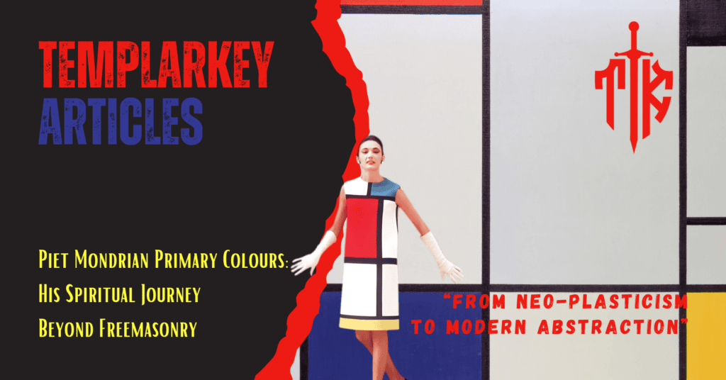
Piet Mondrian’s mature Neo-Plasticism, characterised by red, blue, yellow, black, and white in grid-like structures, has been a key inspiration across fashion, design, and pop culture. Mondrian’s visual vocabulary of primary colours, horizontal and vertical lines, and abstraction was not only revolutionary in art but also adaptable to applied arts, including fashion.
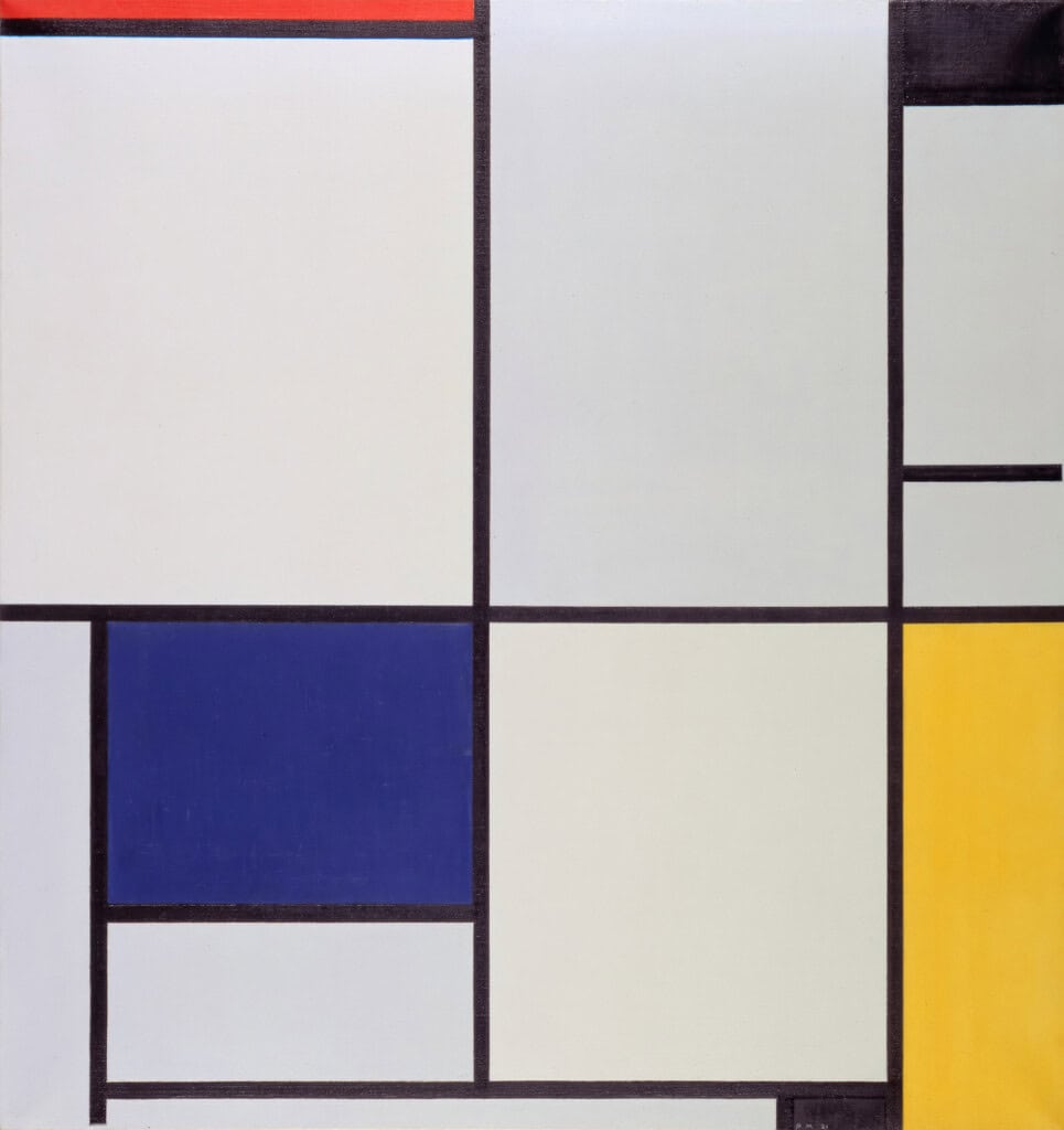
Jean-Charles de Castelbajac, known for his playful, artistic approach to design, has often incorporated similar themes:
- Primary Colors – His collections frequently feature blocks of red, yellow, and blue, echoing the colours used for Christian liturgical vestments, which were also Mondrian’s palette.
- Geometric Structure – Castelbajac’s garments, like Mondrian’s canvases, are clean, graphic, and structured.
- Art Integration – Castelbajac blurs the line between fashion and fine art, much like how Mondrian’s vision influenced applied design, especially through his later influence on the De Stijl movement.
Fashion and Mondrian: Yves Saint Laurent as a Bridge
Before Castelbajac, Mondrian’s art became iconic in fashion through Yves Saint Laurent’s 1965 Mondrian Collection. This collection brought Mondrian’s art directly into haute couture, using colour-blocking to emulate Mondrian’s grid designs. Castelbajac, whose work often celebrates art, pop culture, and colour, operates in the same artistic lineage. He has acknowledged the importance of artists like Mondrian and Saint Laurent in his approach to merging modern art and fashion. See our article Piet Mondrian Primary Colours for more on Piet Mondrian.
Castelbajac’s Artistic DNA
While Jean-Charles de Castelbajac does not replicate Mondrian’s works, his commitment to simplicity, boldness, and universal appeal in design undeniably echoes Mondrian’s philosophy. Castelbajac’s playfulness and vibrant palette are imbued with the spirit of Neo-Plasticism—which flourished in Cathedrals such as Chartres in the Middle Ages—and transformed into wearable art for modern times.
In short, Piet Mondrian’s influence on Jean-Charles de Castelbajac can be seen as part of a broader artistic tradition where the boundaries between art, design, and fashion dissolve—creating harmony and simplicity through colour and form. Mondrian’s legacy lives on through designers like Castelbajac, who reinterpret his artistic vision for contemporary audiences.
Notre Dame de Paris 2024 Colours Symbolism & Castelbajac’s Use of Colour
Jean-Charles de Castelbajac’s reliance on these primary colours is not accidental but deeply rooted in these artistic, physical, and theological truths. By evoking the primary hues, his work gestures to:
- The Trinity, through their symbolic associations.
- The rainbow, as a sign of unity, promise, and renewal—especially relevant in the reopening of Notre Dame.
- The idea that from a foundation of simplicity (the primary colours), all complexity and beauty in the world can emerge, much like divine creation.
Jean-Charles de Castelbajac, a devout Catholic, explained the inspiration behind his designs:
“The light and its radiance guided my creative gesture; I thought of the brightness of color on the resurgent blonde stone of Notre-Dame. My work has focused on the chromatic rhythm and the strength of gold.”
Central to his vision is the golden cross, inspired by the enduring cross of Marc Couturier, which miraculously remained intact after the devastating fire of April 15, 2019. This golden cross appears on each white garment, a colour deeply rooted in the liturgical traditions of festivals such as Christmas, Easter, and Ascension.
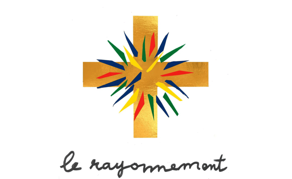
Set against this backdrop of purity, splashes of yellow, red, blue, and green radiate outward, evoking the brilliance of Notre Dame’s stained glass windows. These bursts of colour symbolise the light of faith and the vibrant renewal of the cathedral, reflecting Castelbajac’s intent to merge tradition, spiritual significance, and artistic beauty. Notre Dame was previously restored by Viollet-le-Duc, who explained the colours of the stained glass windows. Castelbajac recreated these sacred colours for his liturgical vestments.
Notre Dame de Paris 2024 Colours Symbolism in Castelbajac’s designs colour becomes more than decoration; it becomes a theological statement. It conveys the eternal, unifying power of God’s creation, where art, light, and faith converge to remind humanity of both its divine origins and its boundless potential.
The debate presented two perspectives: one conspiratorial, the other rooted in artistic and liturgical tradition. Which argument resonates most? The hidden message or the clear historical truth? The vestments of Notre Dame reflect more than colour—they challenge us to interpret the symbols we see.
